
Management Overview
Management Overview Dashboard
One executive cockpit with revenue, margin, EBITDA, OTIF and inventory KPIs versus budget and target.
One overview for the whole leadership team
From scattered data to one realtime view of your organisation.
We connect your systems, centralise your data and build Power BI dashboards so you can steer daily on what is really happening.



SCM Executive Overview
Supply chain costs and margins per channel and location.
Dashboards built for organisations like







Pain points
ERP, CRM, Excel and other systems each hold part of the truth. We bring this data together in one central model.
Revenue, costs, utilisation or operational deviations are often only found after they have had impact. A dashboard makes these developments visible right away.
Exporting, combining and checking Excel files by hand costs time again every month. We automate this process.
One source of truth
Collect data from ERP, CRM, Finance, HR, Operations, Excel and external systems in one central environment. Ready for reliable reporting, analytics and AI.
Showcase
From finance and sales to operations, HR and supply chain. See examples of dashboards we develop for different questions.
One executive cockpit with revenue, margin, EBITDA, OTIF and inventory KPIs versus budget and target.
One overview for the whole leadership team
Revenue, margin, cash flow and budget in one consolidated view.
Instant insight into revenue and margin
Actuals vs budget, OPEX breakdown, margin development and outstanding receivables and payables.
Instant insight into revenue and margin
From scattered data sources to one reliable view of the chain.
Dashboards running in production at organizations such as
Cases
Examples from client projects. The figures shown come from those specific projects and are not a general promise.
In a short intro call we look at which data sources are available, which KPIs matter and how we can bring them together in one overview.
Mockups
Mockups are a fixed part of every project we do. They show up front what your dashboard will look like and how it will work.
A picture says more than a thousand words
Before a single line of code is written, you already see the dashboard. That way we discuss real choices instead of abstract requirements.
We iterate until the final mockup
In a few short rounds we sharpen layout, KPIs and visuals with your team, until everyone agrees on the end result.
Everyone knows what to expect
The approved mockup is the agreement: no surprises afterwards, a tight planning and a delivery that matches expectations.
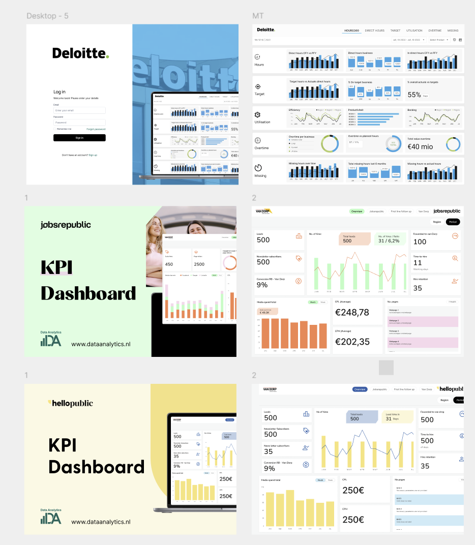
A Power BI dashboard is an interactive, visual view of your key business data on one central screen. Each dashboard shows tiles with visuals from underlying reports and datasets.
A dashboard brings together data from sources such as Excel, SQL and SharePoint. Combining that data gives you insight into performance, trends, bottlenecks and opportunities. You can build one yourself, or have one built fully aligned to your objectives.
Common dashboard types
Power BI dashboards deliver value for both users and builders. These are the main benefits.
Build a dashboard by pinning visuals from an existing report or starting from scratch. Share through the Power BI service, mobile apps, Microsoft Teams or SharePoint.
A dashboard shows realtime data from Excel, databases, web pages or streaming services. Filter, sort, zoom and drill into detail, and query your data in natural language.
Layout, theme, titles and icons adapt to your brand. Custom visuals, alerts, notifications, forecasts and simulations extend the dashboard further.
In the Power BI service you usually open a dashboard from a workspace. You recognize it by the dashboard icon and it loads straight onto the canvas. These guidelines make your dashboard truly impactful.
Always start with complete and well-structured data.
Refresh data continuously so you steer on the latest insight.
An executive needs different information than an operational employee.
Decide up front what you show and why.
Show only the KPIs that add direct value, not loose numbers.
Numbers gain meaning once they are tied to targets.
Too many charts make a dashboard unclear. Keep it logical.
Even a first-time viewer should understand the dashboard immediately.
Business outcomes
Realtime dashboards that are not only good-looking, but also deliver measurable results in your organization.
−62%
reporting time
Example from a client project
From weekly reporting to realtime steering.
100%
data ownership
Example from a client project
One source of truth for the entire leadership team.
+40u
hours freed per month
Example from a client project
Automate reporting and data preparation.
+6.4%
margin uplift
Example from a client project
Steer on margin, mix and capacity with more precision.
Having a dashboard built by a specialist partner benefits your organization in several ways.
You do not have to collect, transform, model and visualize data yourself. You directly benefit from the scalability, security and reliability of the Power BI service.
Specialist knowledge and experience deliver the best solution for your question, including advanced capabilities such as AI, machine learning and data analysis.
Fast access to the information you need to act. You spot trends, patterns and opportunities that would otherwise go unnoticed, and measure and optimize your results.
The origin of your data: an Excel file, database, web page or streaming service.
A collection of related tables connected by relationships, created by importing or connecting data.
A set of visuals based on a dataset, spread across pages with charts, tables and maps.
An interactive view of tiles from a report, dataset or other source, composed on a single screen.
We design, develop and implement Power BI dashboards across industries. This is the route we take together with you.
We map your objectives, wishes and requirements and analyse your current sources, systems and processes. You get advice on feasibility, value and cost.
We design a visual prototype: layout, theme, titles and icons, with the right data and visuals. You give feedback before we build further.
We set up a scalable, secure data warehouse using modern cloud services such as Azure Data Factory, Azure SQL Database or Microsoft Fabric.
Tables, columns, relationships and calculations form the basis. We transform and clean data with Power Query and calculate and aggregate with DAX.
Based on prototype and data model we build tiles and visuals, with interaction such as filtering, sorting and drill-down.
We test functionality, accuracy, completeness and usability, resolve findings and deliver after your approval.
We teach your team to use, manage and maintain the dashboard, including sharing, updating and extending it.
We have built dashboards for a wide range of industries and sectors. A selection of those dashboards and the benefits they deliver.
Insight into patients, processes and performance per department, diagnosis, treatment and care provider.
Control over projects, clients and staff: from utilization and margin to progress and development.
Monitoring and evaluating policy, services and organizational performance.
Visibility into students, learning processes and results per class, level, subject and teacher.
Overview of portfolio, sales and rental activity and market developments.
The questions we receive most about Power BI dashboards, and our answers.
Een Power BI dashboard is één scherm in Microsoft Power BI waarop de belangrijkste cijfers van je organisatie samenkomen, zoals omzet, marge, voorraad of bezetting. De data komt automatisch uit je bronsystemen en wordt bijgewerkt, zodat je niet meer handmatig rapporten in Excel samenstelt.
Dashboard demo
Tell us which systems you use. In a 30-minute session we show what your numbers look like in a live dashboard.
Discover how realtime dashboards help your organization steer faster and better.
No sales pitch: a short 15-minute call with one of our specialists. Call us or leave your number.
or call us with Maurice?